Looking at the newest Fords and Chevy’s one thing is clear… Ford is slipping. Ford is concentrating on making everything look like generic Aston Martins. Including the new 2015 Mustang. Now, I’m really digging the new Mustang. A lot. I mean… a lot… Love it. But when all the cars are starting to look the same way… it waters the Ford brand down.
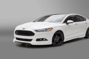
Chevy is doing much the same with all their cars… The Cruze, the Malibu, the SS… they all look the same from the front. This is disappointing. Honestly, it’s hard to tell them apart on the street. Save for the Camaro and the Corvette.. They all look they came out of the OctoMom. I’m not saying that they look bad individually… But when you walk around a Dealership… It’s a shallow gene-pool. It’s like the same guy just phoned in the designs.
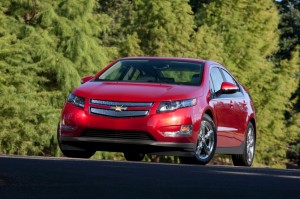
Making everything in your brand look the same… isn’t making it all look like Family. It makes everything look Inbred. This may have worked for British Royals through the middle ages… but it doesn’t work for me. I don’t know about you. What do you guys think about that?
I think where designs have really taken off, is with the interiors.
Ford’s interiors are looking dated even though they are all new. I’ve seen Mid 80’s Toyotas with better interiors than most of these new Fords. (save for the new Mustang)
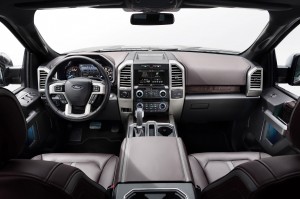
Take a look at Ford’s new F-150 Interior. Who designed this? A former employee of Duplo Blocks? Come on… That’s terrible. Now take a look at the new GMC/Chevy’s interior.
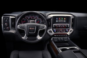
Okay, that’s looking badass. That looks clean and modern and fitting of a 2015.
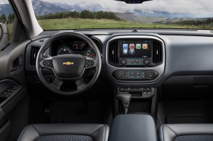
Here’s one out of the new Colorado. Simple, clean… that’s nice. The new 2015 Mustang has a nice cockpit.
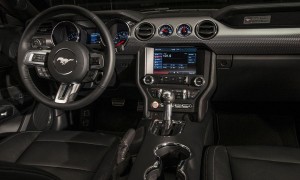
But it’s a bit busy… there is something going on everywhere. Ford still likes a lot of little buttons, which I find slightly distracting, but it’s got a good layout so it still works. At least Ford and Chevy are not using a Multi-Function Dial Selector Game Controller on the center console. I hate those dials. They are not as simple and intuitive as the automakers seem to think. You end up playing around with those things more than paying attention to the road.
One thing I do not like about a lot of the new interiors… The multi-function touch screen infotainment centers. While I like them… I do not like them being positioned so far away from your driver’s field of view. It’s quite easy to be distracted from driving. I like my Chevy’s system as most everything I need to do while I’m driving, I have the controls on my steering wheel and don’t need to take my eyes off the road. But with a younger and more distraction-prone driver… I can see these as being problems. I think these screens need to be as high as possible and closer to driver so the eyes are not being pulled so far away from the windshield.
That’s just my opinion… What’s yours?

A lot of what’s driving the exterior design of vehicles is the CAFE standards imposed on manufacturers by the government. If you managed to pick up a 2 mile per gallon improvement with your new transmission but your retro looking bodywork cost you 1 mile per gallon of it you’re not getting enough return on your investment in engineering. If it doesn’t work in the wind tunnel its probably not going to make it to the showroom floor except for an icon or two like the Mustang or the Camaro or the Challenger – and none of them sell in sufficient numbers to cause a major impact in the CAFE numbers.
As far as the interiors and the instrument panel layouts they all look pretty much the same to me. Ergonomics dictates certain things have to be in certain places for most people and given the amount of controls involved and the amount of information that must be conveyed to the driver the die is pretty much cast unless you get into state of the art heads-up displays. Heated/cooled/ventilated seats are nice as are seats actually designed to comfortably accommodate someone larger than my teen-aged niece. Show me seats made from baseball glove leather and you’ve gotten my attention. Other than that interiors are sort of a non- issue to me.
The focus groups say make your cars look alike. Unfortunately all cars are so stylistically similar it’s getting ridiculous. “From BMW spread the Lumpy Curvy Look to the Japs, then to the Yanks, but the French, remain butt ugly and the Italians either magnificent or a rolling pail and in any case they don’t work.” Or words to that effect from a guest on Wind Tunnel on the Late and occasionally great, “Speed Channel.”
Geoff
Who likes clean designs: Honda Accord Coupe 2004, 1989 Chrysler Lebaron Convertible, 1968 Ferrari GTB Daytona, Eagle Talon, 1992 Eagle Monaco, Studebaker Avanti, and maybe half the Alfa Romeos 2 seaters ever built..
The Goldfinger DB5 look is great for my elementary-school memories, but if Ford really want’s to get my second-adolescence going they need to include some of the sweep and swoop of the GT-40. Go Steve McQueen!
The DB5 still looks great. Watch Skyfall. That design aged very well.
Gonna have to rent that!
I love the inside look of the new Colorado’s and think they are progressing nicely with time.